I think that probably the debate on Fixed against liquid will never find a definitive word. But now perhaps there's another option: the Progressive Layout. In this article, that is a small extract from the Italian version, we'll see how to easily turn with Javascript a CSS-based layout (fixed or fluid doesn't matter) into a progressive one.
Progressive layout combines the advantages of both fixed and fluid layout: it's a fixed layout under and over certain resolutions, but it's fluid between. In the liquid stage the layout is quite different from the classic fluid layout, since the width and the margins of the layout vary accordingly to the browser width.
Let's see the first example. It's a two column layout which is:
- fixed (540px) below 540px of client width;
- fluid between 540px and 1024px;
- fixed (850px) over 1024px of client width.
You could easily see the width varying from the ruler on the footer by resizing your browser window. Now, let's see how the example would render with Javascript turned off: it's a classic fixed-width two column layout.
How does it work
If you see the code of the example and the version without Javascript you'll note that they share the same CSS, and mostly the same markup. The only difference is in one line in the markup, before the closure of the body tag:
</div>
<script type="text/Javascript" src="progLayout.js"></script>
</body>
You could view the source of the script here. It's a very short script, that runs when the HTML of the page has been loaded, but before the page is fully displayed, that triggers the width of the main wrapper of the layout according to the client width. This is done also everytime the browser window is resized. To customize the script, you just have to change the fist line of it:
MakeLayout("container",540,850,1024);
The four paramaters, separated by a comma, indicate in order:
- Id of the global container of the layout
- Min width of the layout
- Max width of the layout and..
- .. client width when the max width will be reached
You can view how the progressive version serves a better layout, that is suitable for every resolution instead of being fixed. This is done just by embedding a single Javascript file and setting up four parameters in it. That's the strenght of the script, that can transform almost every layout into a progressive one without changing the CSS. Now, let's see another example.
Second Example: a progressive three columns layout
for the second example I started with a hack-free, robust three columns liquid layout wich uses source-ordered columns, opposite floats and sliding faux columns. You can wiew here the example with Javascript off.
The script also in this case is included before the closure of the body tag. Respect the first example, in the script has been changed the first line. The parameters of the function, as is the first line of the script, are:
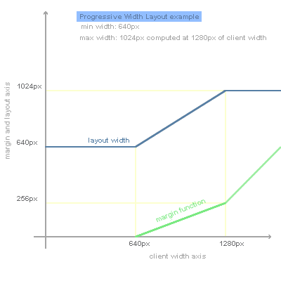
MakeLayout("container",640,1024,1280);
This in order to get a progressive layout with the div with id "container" that has a minimum width of 640px and a maximum width of 1024px, reached at client widths starting from 1280px. To help you understand how does the script works, I've prepared a small graph that shows how layout width and total margins vary in function of the client width:

The differences between the progressive layout and the version without js are remarkable: the enhanced version doesn't break at low resolutions, has the margins optimized according to client width and preserves a maximum width at really high resolutions.
Credits, Conclusion and download
Ideas often grow out of other ideas. Progressive layout has two main sources of inspiration: Resolution Dependent Layout by Cameron Adams, a very clever way to serve central content depending on the browser width, and Jello: a different liquid layout by Mike Purvis, a very nifty solution and probably the (nearly) first progressive layout on the web, entirely developed with CSS.
Color palette of the examples is borrowed mainly from one of the design I like most: Bartelme Design, an impressive website in its simplicity.
Before conclusion, a few words on compatibility: the examples of this article have been tested in IE5, IE5.5, IE6, Opera 7.6, Safari and Firefox: this is a quite wide range of browsers I think. Compatibility should be extended to browsers with a really basic DOM support too. There's an important point about progressive layout: it should be considered as an enhancement to both liquid or fixed layouts. So, it's important to serve good a CSS layout first, since the underlying not-enhanced version will be displayed to users with Javascript disabled.
If you're starting to think if it's right or not to use Javascript for presentation, perhaps you may want to read the best article on the subject: Presentational Javascript. by Bobby van der Sluis. And consider that Progressive Layout is just an enhancement, doesn't affect content nor accessibility but could improve usability and readability.
You can download sources and examples here. Enjoy!
Other articles in english by the author are Nifty Corners, More Nifty Corners and STR: SwishMAX Text Replacement.